
Today’s post is courtesy of this question from a reader:
Can the SQLDeveloper Report/Chart feature create a line chart where x contains date/time and y the values to be plotted?
The answer is ‘Yes!’
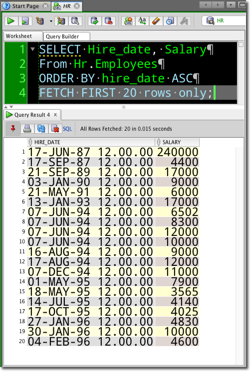
I’m going to use HR.EMPLOYEES to give me my data.
I start with…
SELECT Hire_date, Salary
FROM Hr.Employees
ORDER BY Salary ASC
FETCH FIRST 20 ROWS ONLY;
So let’s turn this into a report.
SHORTCUT: In your query result-set, right-click and select ‘Save Grid as Report…’
We’re going to want a CHART report. So set that, and then go to the chart properties.
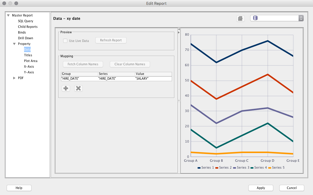
Now I’m going to need to assign values for the Series, Group, and Value.
This sample rendering shows 5 different Series, or lines plotted.
My query only has 2 values to choose from, the salary and the date. If I assign either of those to the Series property, I’m going to have a bunch of single point lines, which aren’t really lines at all.
I need a 3rd value.
So back to our query.
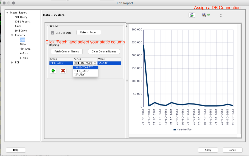
SELECT 'Hire-to-Pay', Hire_date, Salary FROM Hr.Employees
ORDER BY Hire_Date ASC
fetch FIRST 20 ROWS ONLY
‘Hire-to-Pay’ will be static across all of the returned rows. So I can use THAT for my Series.
Back to the properties.
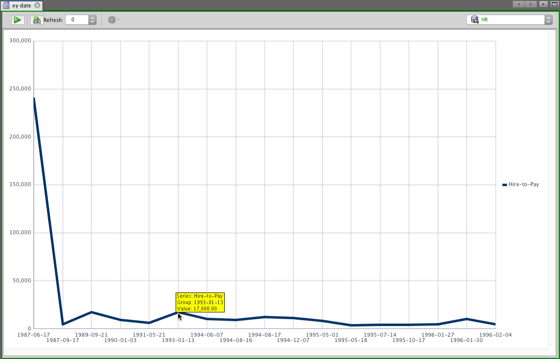
Now run your report.
Voila.
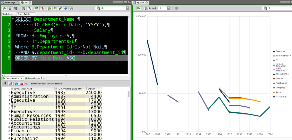
Multiple Series
So I want a ‘line’ for each department. The hires are by day, so not every department hired someone on every day. To get a bit closer, I consolidated it to YEAR. And since no one knows the department_IDs, I joined to departments to get the names.
I also set the chart scale to Logarithmic to make the values/lines a bit easier to evaluate. There are tons and tons of chart properties you can set. I also asked for the series lines to be smoothed out vs straight line point-to-point.


9 Comments
Tank you so much! Helped me!
Now, suppose I’m looking at sales over time (such as in a real estate market) and I want to see them on a scatter plot. A spreadsheet like Excel allows me to see every sale (Y) even if multiple sales occur on the same date (X). But in SQL Developer, the scatter plot appears to pair up rows of data of just one attribute (row1 is X1 + row2 is Y1, row3 is X2 + row4 is Y2, . . .). Is there any way to do a scatter plot a la Excel? And can I plot a trendline on top of a scatter?
Good question, and I do not know.
Can i save the chart? I don’t find any way to do from SQLDeveloper. My workaround is the generate a screenshot!
Thanks,
Enrico
the reports can be saved as PDFs or HTML – the HTML charts work nicely I think
Yes, you can right click on the report and save as HTML.
Very nice. I’ve set the auto refresh to update. Is there anyway to suppress the popup query running window in SQLDeveloper?
Hello Jeff,
I hope it’s ok if I post a question here. Could you tell me how to actually display the date AND time on a chart? I can not get it to show the time on the x-axis. If the resultset is contained in a few days or a 24 hour time frame, I hoped SQL Developer would adjust the scale of the x-axis automatically, but that does not happen. As a result the scale of the x-axis is per day and that is too coarse.
I could work around the problem, by converting the date to char, but that could give some issues with sorting. It just feels like I’m missing something and I have trouble finding an answer to this question searching the internet.
Thanks for your time.
Regards,
Erik.
I’ll have to play with it.. On Tuesday, after the holiday. But I’m sure there’s a way.