
There are three places you may see SQL Developer Web.
- You have ORDS running in your organization, Cloud or no Cloud.
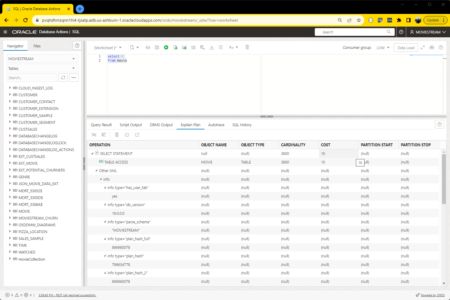
- You are an Autonomous Database subscriber in Oracle Cloud (OCI)
- You’re using the Database Tools Service in OCI
Our SQL Worksheet also has three methods for displaying plans.
- Flame graph
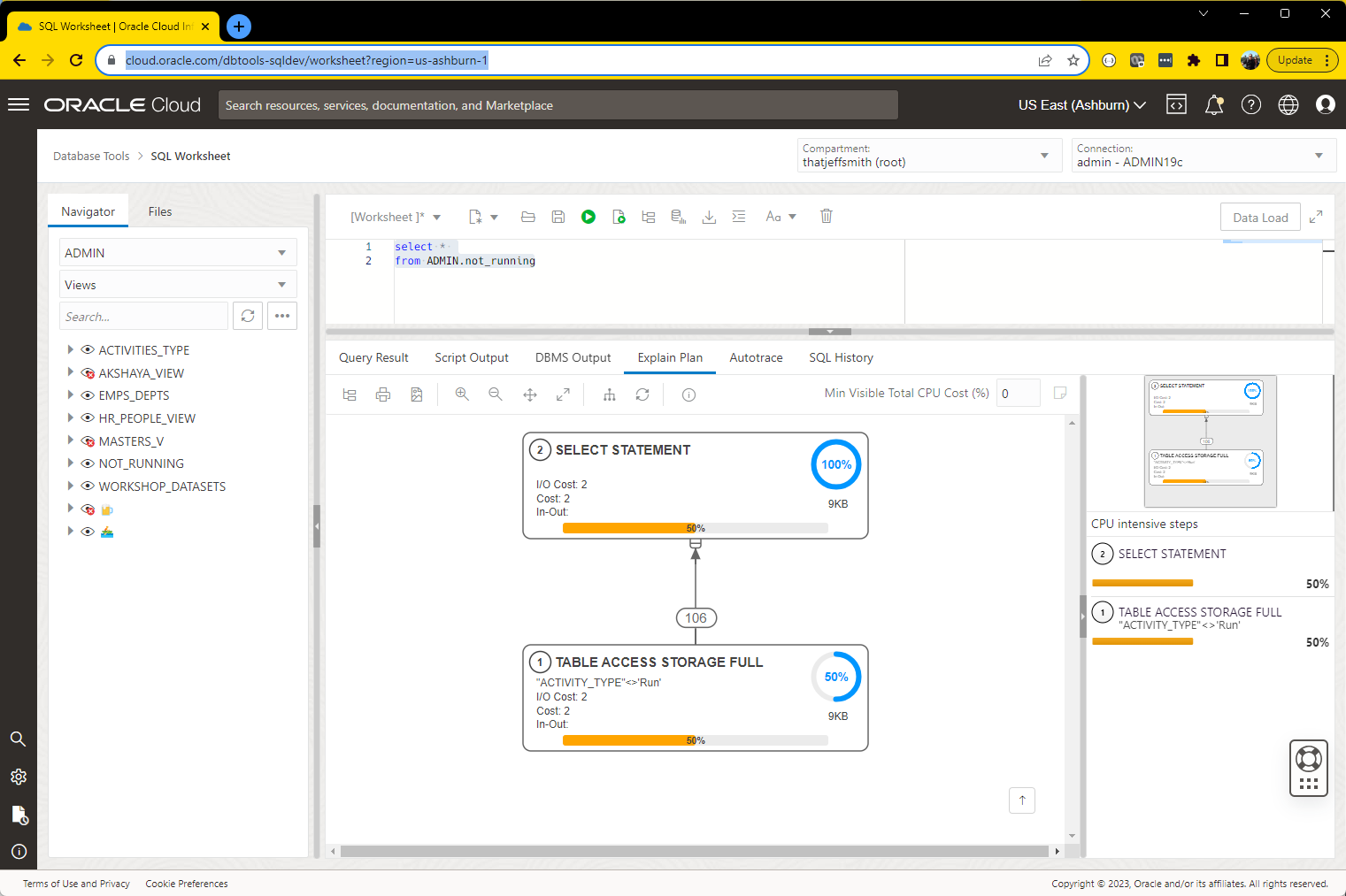
- Flow chart BLOG POST | VIDEO TUTORIAL
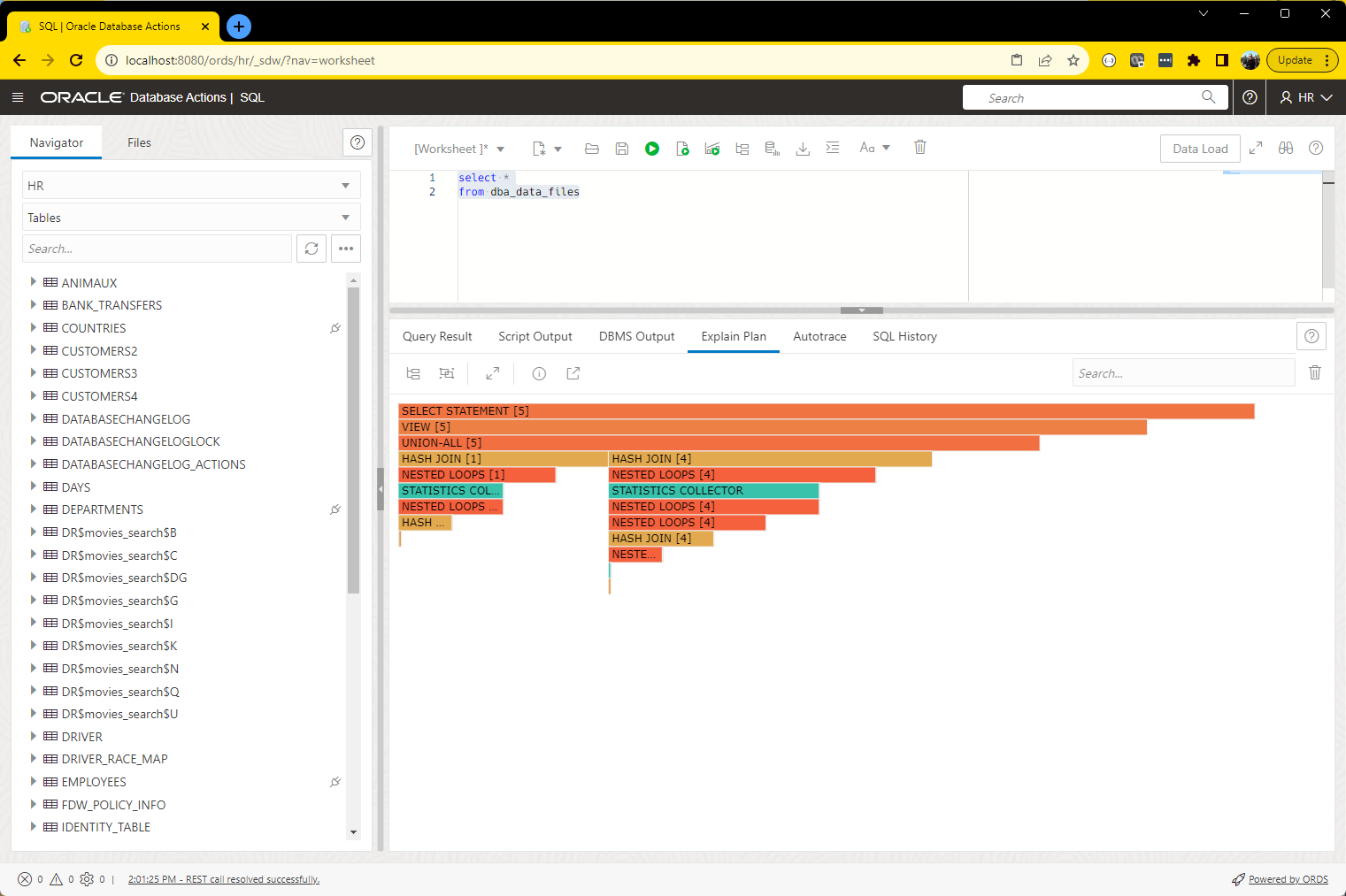
- Tree view
Flame graph is new for ORDS 23.2: Quick Tour
Let’s take a quick stroll through our new flame graph display.
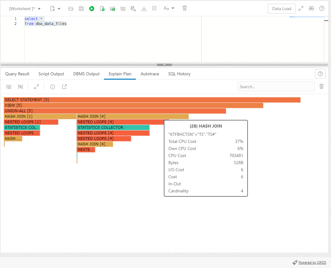
I like this general description of flame graphs from Grafana.
The flame graph takes advantage of the hierarchical nature of profiling data. It condenses data into a format that allows you to easily see which code paths are consuming the most system resources, such as CPU time, allocated objects, or space when measuring memory. Each block in the flame graph represents a function call in a stack and its width represents its value.
https://grafana.com/docs/grafana/latest/panels-visualizations/visualizations/flame-graph/
In this case, the ‘code paths’ are the Plan steps, and the values are the Total CPU Cost as a percentage.
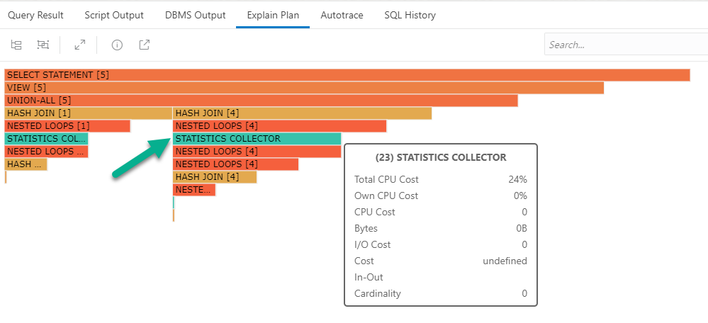
If I look at the 2nd Stats Collector item on the chart, I can see that:
- the total amount of CPU ‘work’ for this plan and everything under it, is 24%
- the actual amount of work this step is responsible for is 0%
- the length of the horizontal bar chart maps to the total cost as a percentage
The SELECT STATEMENT ‘daddy’ step has 100% of the CPU work attached to it, and all of it’s children, that’s why it’s bar extends the entire length of the graph.
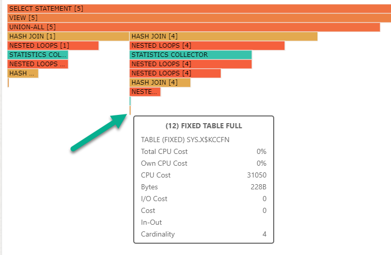
Now, what about those miniscule bars at the bottom?
But wait, how do I get it?
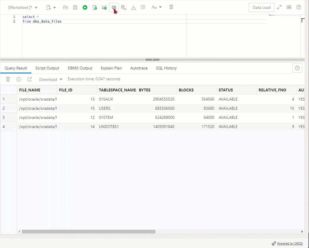
Type query in Worksheet.
Ask for plan.
Toggle.
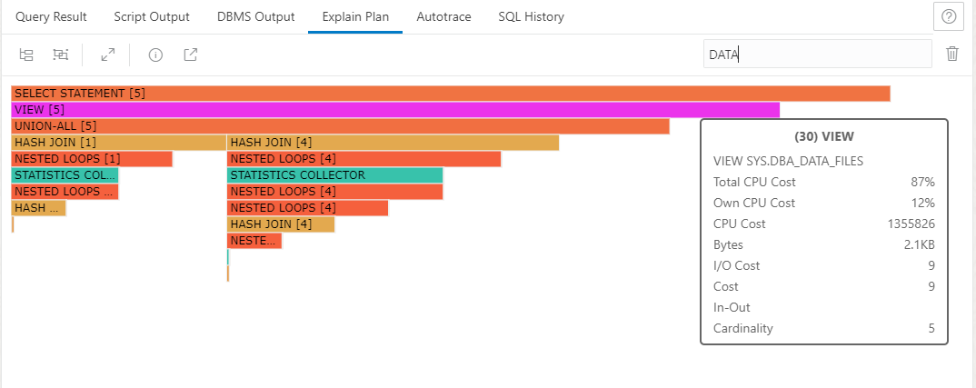
Looking for something?
Maybe a particular segment, index, or table name?
Use the search, we’ll highlight the bar if there’s a match on the object name.
Which one should I use?
Use the old school tree if you want to just look at the raw data.
Look at the flow chart views if you want help looking at a complex plan AND have access to all of the info attached to a particular step.
Check out the flame graph if you have a very complicated plan and you need a keener eye to ID where all the CPU suck is happening….or if you need a screenshot you can send to a developer to make it clear why ‘the customers are angry.’
Wait, is that all?
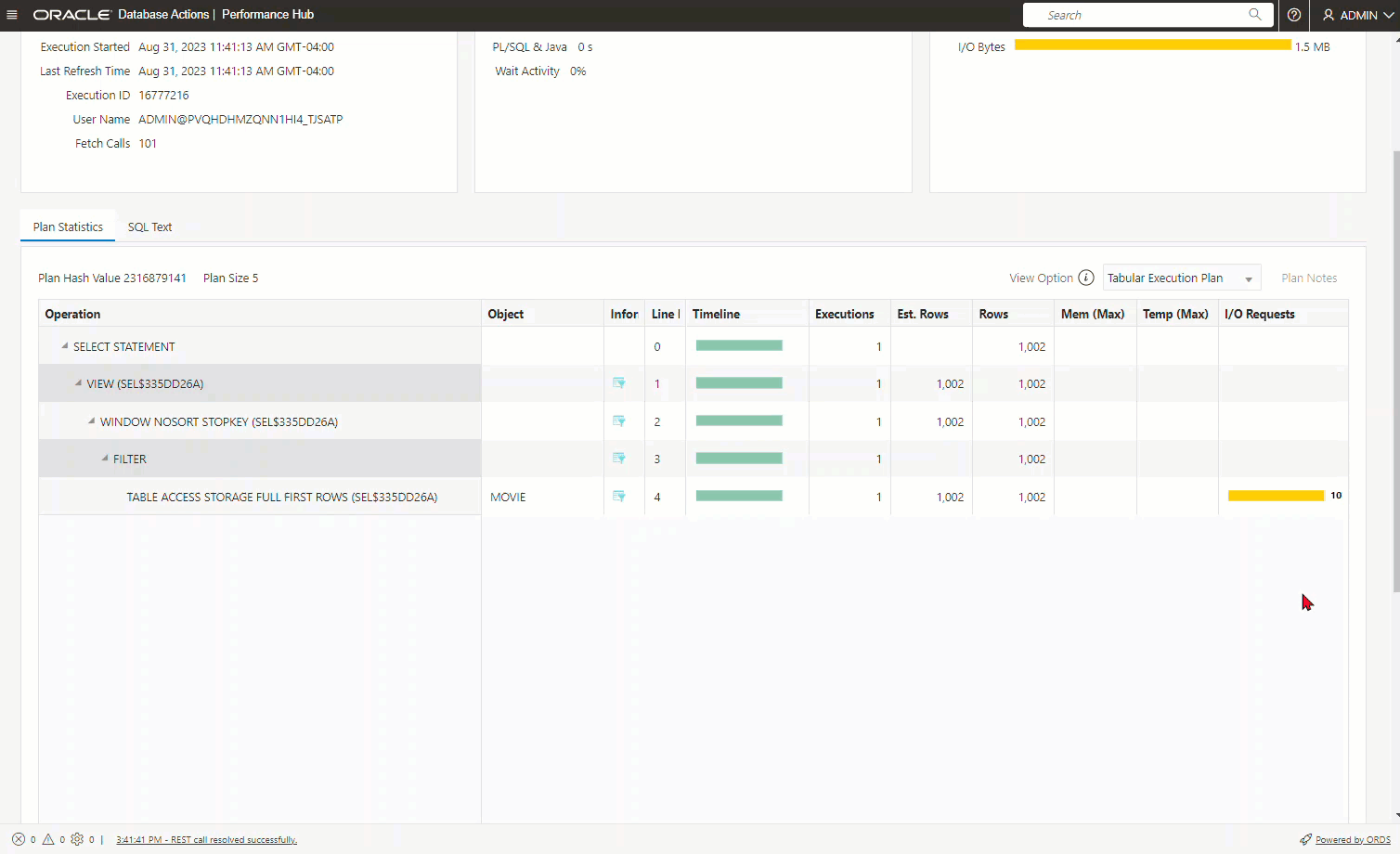
Some environments may have access to Performance Hub, or PerfHub. That’s a diagnostic and tuning pack feature enabled for 19c and higher versions of the database.


2 Comments
Is it able to show the flame diagram using row source statistics data?
Today it’s what you see is what you get, but it’s a fairly new feature and, we’ll take suggestions for improvements in the future.
I also hope to have these plan displays put into our new extension for VS Code as the ‘next step.’