
ORDS 22.3 was released yesterday, and I included a quick recap of the features of note. One of those was our new Oracle Explain Plan display.
Don’t want to take a tour? Would you rather just read the docs? They’re built into the application, so you don’t have to go and Google anything.
Hate reading? That’s OK, I made a video, too! It’s at the bottom of this post for your convenience.
A “quick” guided tour
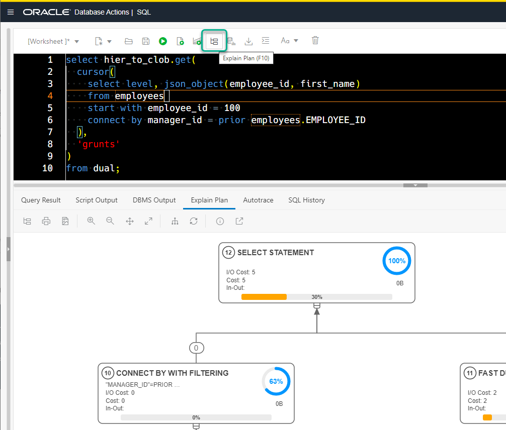
To generate an execution plan, we’ll need a SQL statement. And I’m going to go with my friend Stew’s example.
SELECT hier_to_clob.get(
  cursor(
    SELECT level, json_object(employee_id, first_name)
    FROM employees
    START WITH employee_id = 100
    CONNECT BY manager_id = prior employees.EMPLOYEE_ID
  ),
  'grunts'
)
FROM dual;
Generating the Oracle Explain Plan
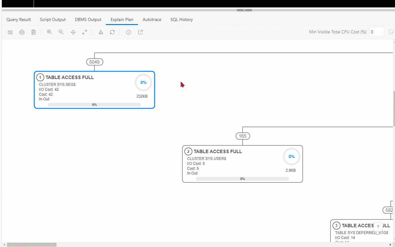
Type SQL into editor, hit the Explain Plan button.
Now before we go any farther, let me say that if you liked the old plan, you can keep your plan.

What’s are we looking at, here?
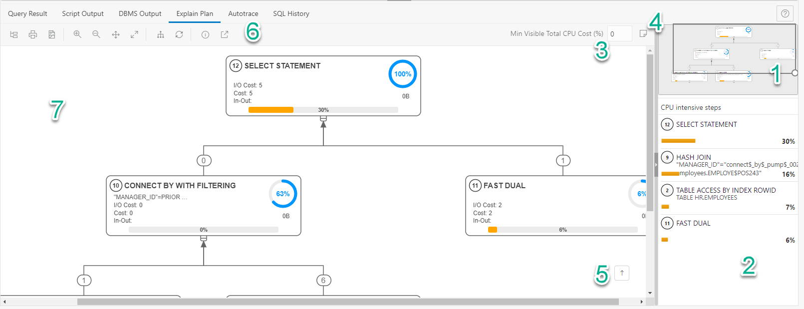
- A minimap of the entire diagram. You can move the box around to re-center the viewable area of the plan in section 7.
- A list of the CPU intensive steps along with a quick peek into what that step is doing. Clicking on a step here, will take you to that step in the diagram.
- If you don’t want to see any steps that do not take at least X% of CPU cost – put that threshold here, we’ll hide the rest.
- Show me the plan notes.
- Navigate me to the TOP of the plan.
- The Toolbar
- The Plan display area
A Quick Navigation Demo
I’ve changed my query to get a more complicated plan. This is just a data dictionary view (DBA_DATA_FILES.)
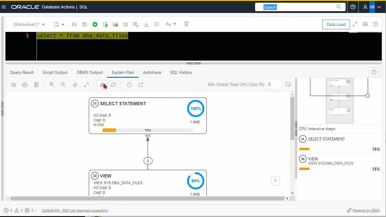
If you’re somewhat new to SQL tuning, you might not know where to start. We tried to give you some pointers via the ‘CPU intensive steps.’
Fellow Twitter buddy Julian put it this way –
Just query the dictionary 😉 and even a 49″ will be too small. But honestly I like especially the “CPU intensive steps” part, could be a good starting point if you are not that experience in perf tuning. pic.twitter.com/UCkbNbgzoS
— Julian Frey (@JulianFreyCH) October 7, 2022
Another way to navigate your plan
Select a step in the plan. Then hit TAB or SHIFT+TAB to navigate the plan, sequentially. Like so:
Plan Steps, what are we showing?
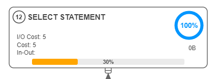
- 12 – this is the 12th step of the plan
- 100% – This is the CPU cost % for this step and ALL of it’s children
- 30% – This is the CPU cost % for this specific step
- 0B – Number of bytes associated with this step
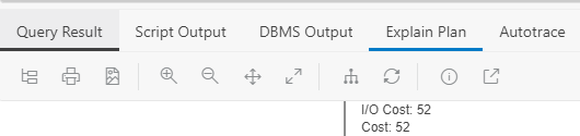
- I/O Cost 5 – I/O cost of the operation as est by the optimizer’s cost-based approach
- Cost 5 – Overall cost of the operation, function of the
CPU_COSTandIO_COSTcolumns - In-Out null – Pertains to Parallel degree operations, more on this later
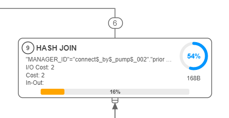
And what’s this ‘6’ number?
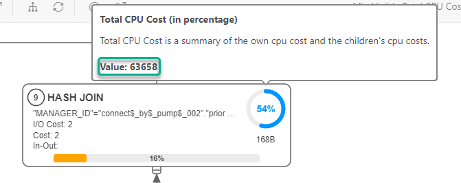
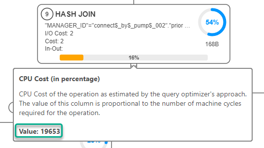
I don’t want to see the Cost % – show me the real numbers!
Just mouse over the metric! Not only will we show you what you want, we’ll also give you a description of what you’re looking at.
And same for the 16% number…
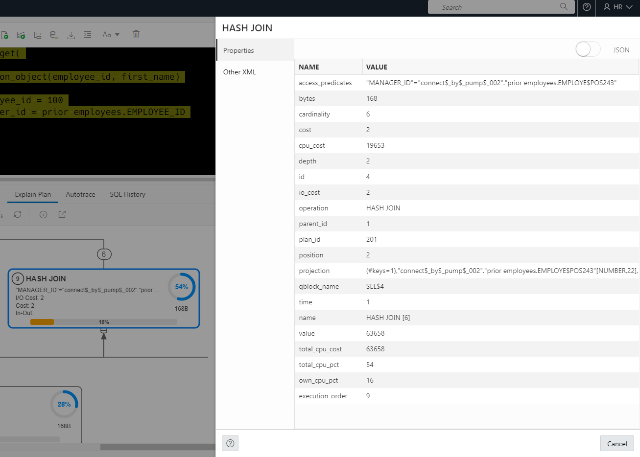
How about the ‘raw’ plan data? You know, from the PLAN TABLE?
Just double-click on the plan step.
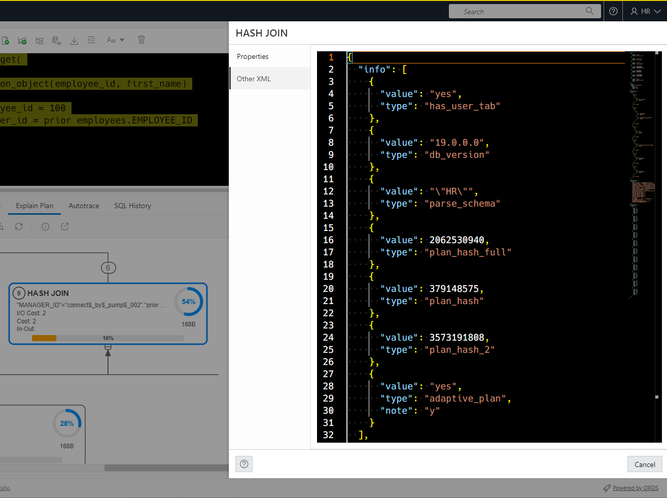
OTHER XML – what’s that?
The plan table has a TON of columns in it. But at a certain point, the optimizer team decided that any new columns would go into a XML document – this was way before JSON came into vogue (or even existence!)
You’ll find things like plan notes in there, as well as HINTS you can use to reproduce certain elements in your plan and other fun bits of information.
However, reading XML documents is kind of a pain. So, when you click on that panel, we’ll show you this –
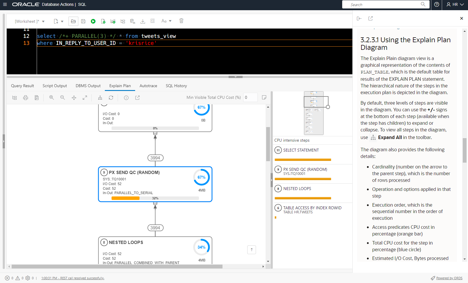
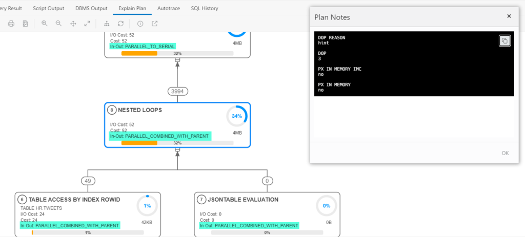
And the In-Out stuff?
It’s all about parallel degree queries and execution plans. I’m using a different query now to get a parallel degree plan. You’ll notice the Plan Notes generally have more to say when parallelization comes into play.
And finally we have the Toolbar
- toggle to the old plan display
- save to SVG
- Zoom in
- Zoom out
- Best fit to screen
- Actual size
- Expand all – by default we only show the top 3 levels of the plan, so you can concentrate on the more important pieces. Click this button to see the ENTIRE plan.
- Reset
- Show me the SQL behind the plan
- Open this plan in a full-screen display
Is this the end?
Of this blog post? YES! Of this technology? NO!
This is for EXPLAIN PLAN. I want to make this new display for Cached Plans (in V$SQL_PLAN), and anywhere else in the app we show you a plan.
And this is ONLY in SQL Developer Web. I want to build this into our desktop tools as well!
And finally, finally – this is our first go at this. I’m sure you’ll have ideas on feedback and improvements. Let us know what you like and what you love!


2 Comments
This looks really great. Nice work. Will it be available in the desktop version also?
Thank you.
I hope to have it in our next-generation SQL Developer desktop product, yes. News on that hopefully in 2023.