
A few weeks ago we released version 21.4 of Oracle REST Data Services, and one of the new features was the addition of Scheduler Support in SQL Developer Web. If you need to catch up on what all was included with 21.4, you can do that here.
The Oracle Database gives us two different scheduling systems, DBMS_JOBS and DBMS_SCHEDULER. I find as always that Oracle-Base has a VERY nice overview of DBMS_SCHEDULER, and highly recommend you give that a read if this is a new topic for you.
The Scheduler has more than a few components, including but not limited to:
- jobs – what we’re scheduling
- programs – code that you want executed when a job runs…vs putting that into the job itself
- windows – a time period you want the job to run, like…’Weekends’
- chains – groups of jobs you can ‘chain’ together with steps, even running in parallel.
SQL Developer Web will give you an interface for seeing what you have defined, what’s ran before, what’s scheduled to run in the future, and can visualize those chains so you can make sense of what they’re doing.
A Quick Demo
So if I’ve taken Tim’s scheduler demo, and in particular the scheduler chains, I can go into the Scheduler section of SQLDev Web and start having a play:
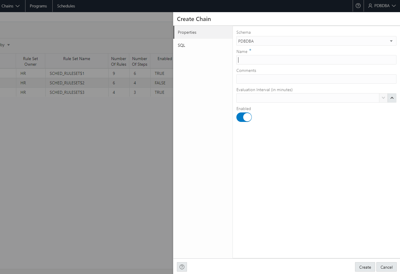
As we have done with several other features in SQL Developer Web, we’re starting with a series of reports. Support for creating jobs, windows, chains, etc via wizards and dialogs will come in an upcoming release – see a sneak peek at the end of this post.
So let’s take a look at what you can do today in 21.4 (and coming soon to Oracle Autonomous Database).
Show me things that are ‘Broken’ or running ‘Right Now’
When you click into the Scheduling, we’re going to give you a report of what’s broken, and enable you to quickly navigate to what’s currently running.
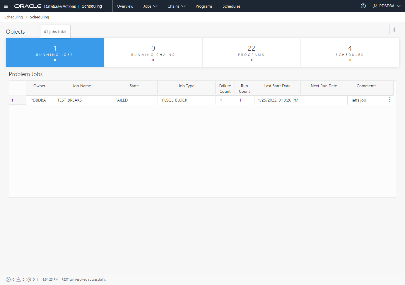
So as an admin, odds are I’m interested in these running jobs or broken ones. That’s why we’re funneling you here. If you’ve had 100% success, we’ll drop you into a screen showing an overall scheduler job summary.
Let’s click into that list of running jobs.
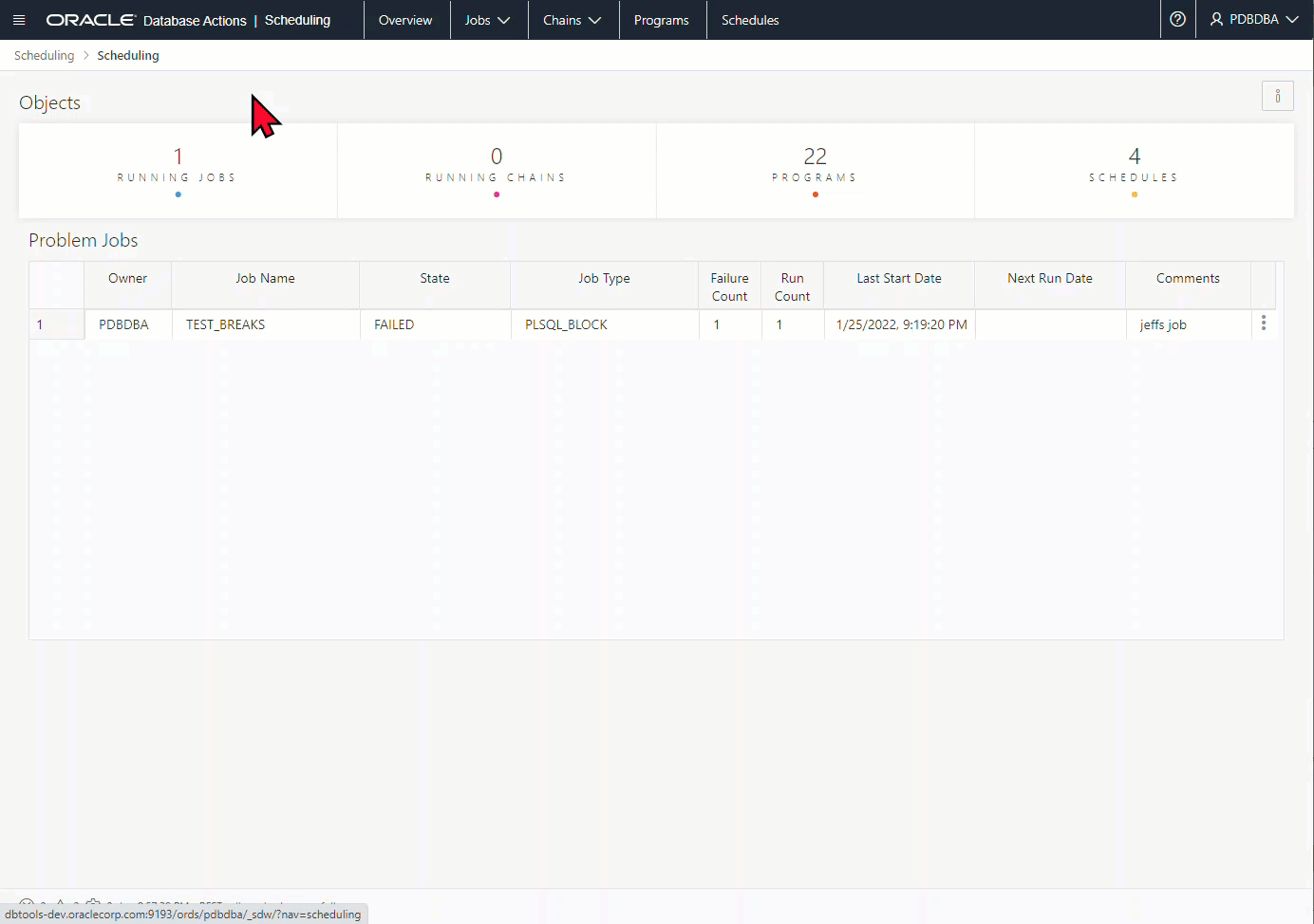
Back to that job that had problems,
What went wrong?
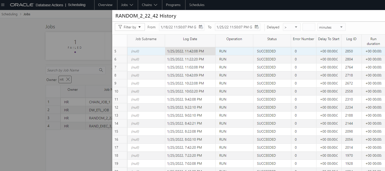
Job History Reports
If I drill into that particular job’s history, I can see it’s just run the one time, and from that job run, I can see the errors encountered.
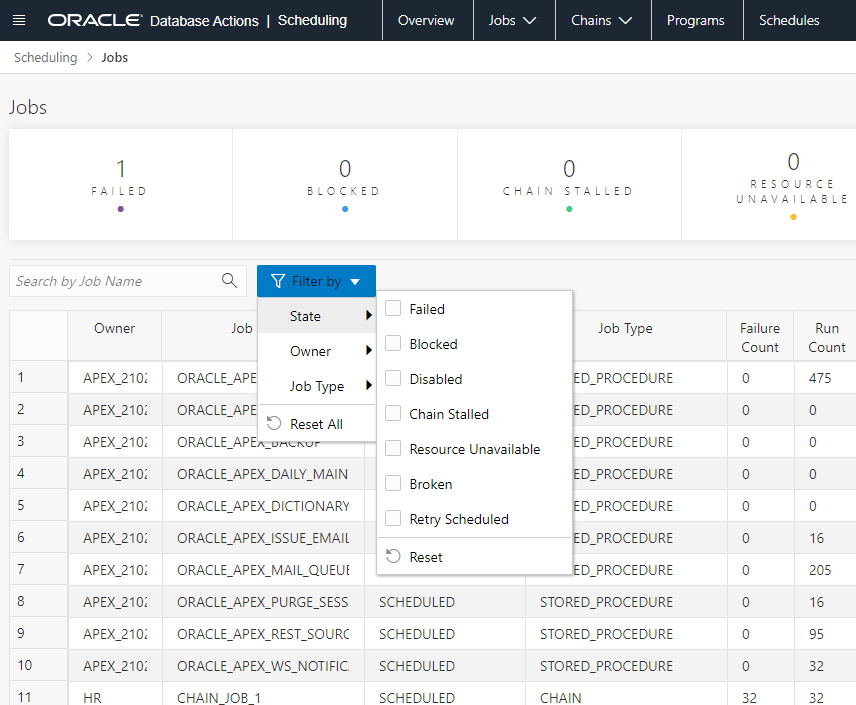
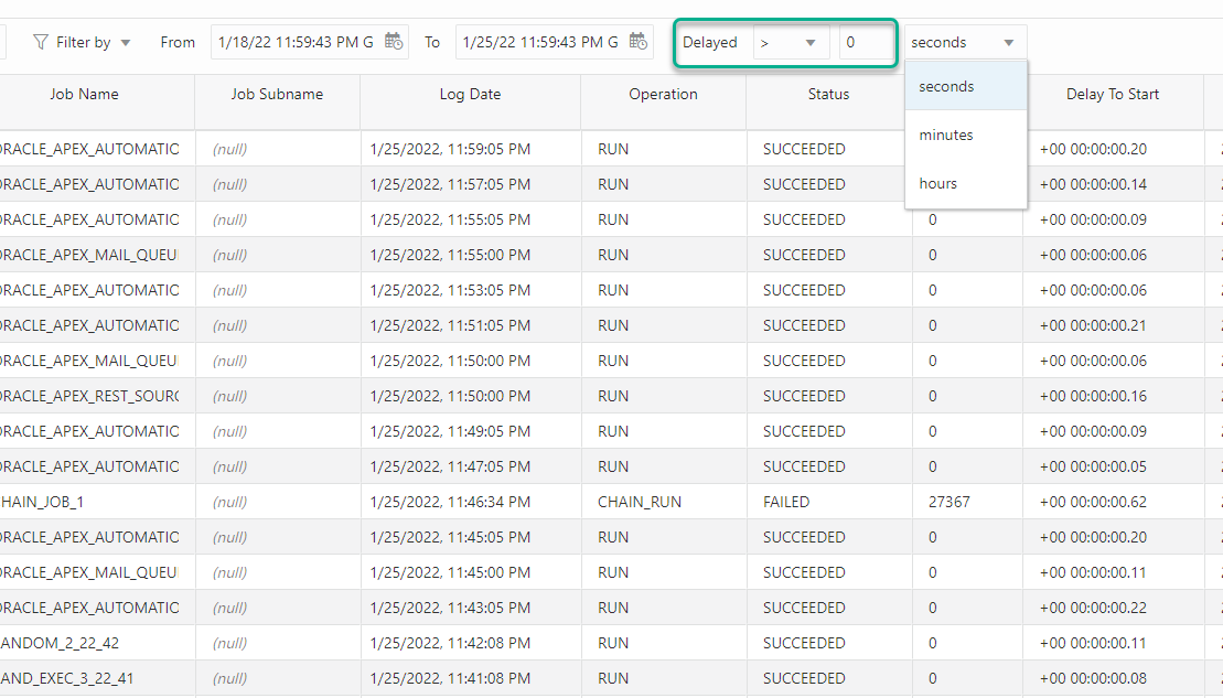
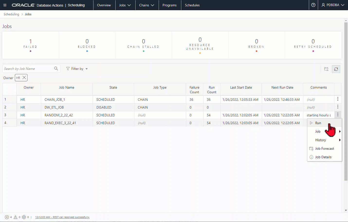
Just show me all the jobs already
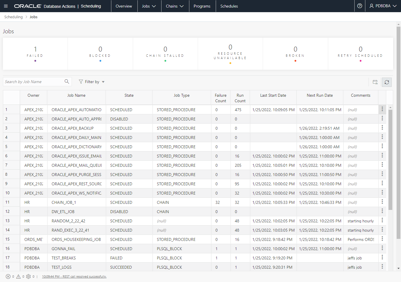
Filtering will be quite useful here. I can filter by job owner, state, or job type:
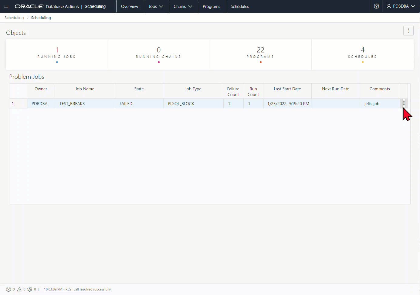
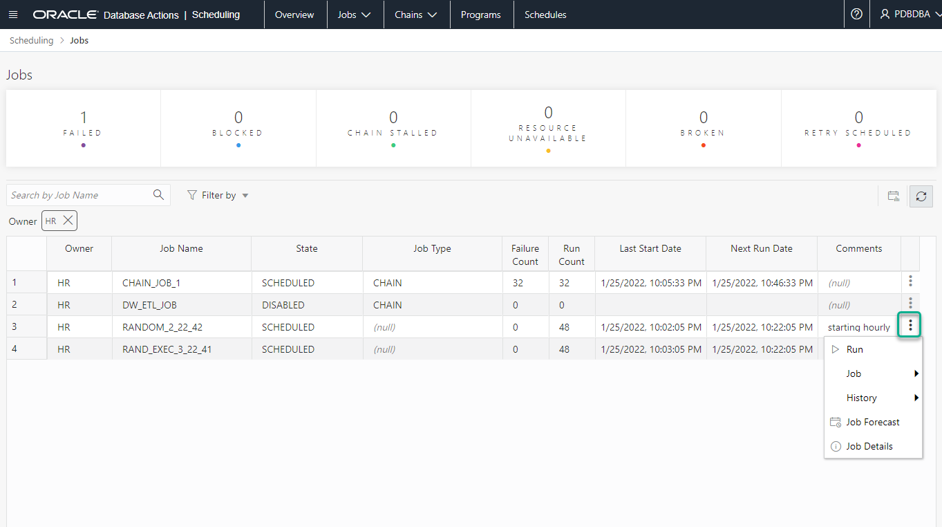
Once you’ve managed to drill down to the job you’re interested in,
If I scroll right, I can find the ‘Action’ button in the last cell in each row.
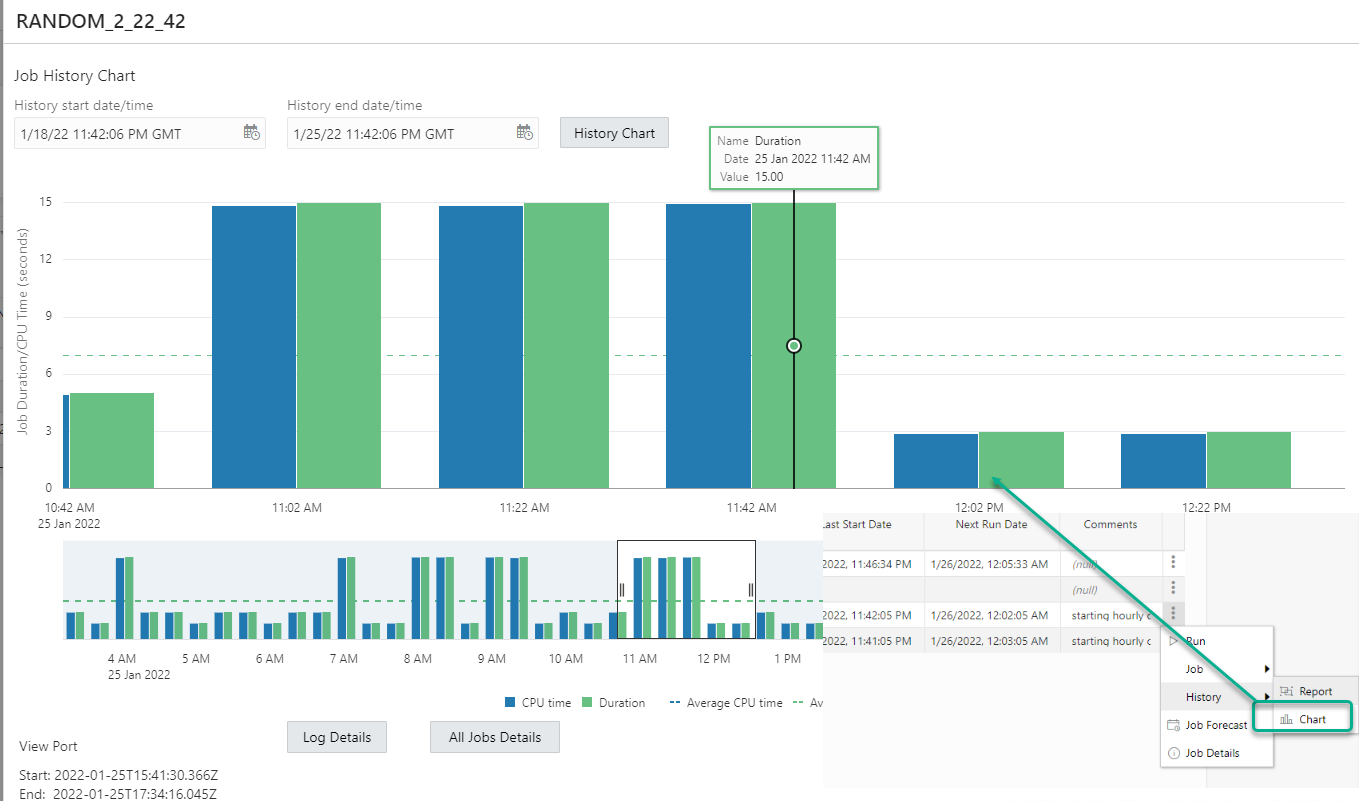
Here’s another grid report for what’s happened for a given time period on this particular job.
Wait, what’s this about?
You’ll see this widget on most of the job history reports. If something isn’t running on schedule, there could be resource conflicts, more on that in a second.
A lot of numbers here…is there a better way to gain insight into what’s happening?
You bet, how about a chart?
Job History Charting
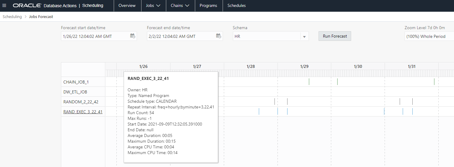
Show me what’s going to happen next week, please
I can bring up a future timeline of all the jobs that will run in the database, based on their average delay, time duration, and schedule start times.
By default we’ll show you everything, but you can also filter that down by schema, or you can also ask for a timeline of 1 or more selected jobs.
Here’s everything that’s going to run HR in the next week…
I don’t recognize these jobs, what are they doing?
Let’s pull one up and go through the details!
We’re going to try to embed charts into more and more of our dictionary based reports. What do you think about that?
Something we’re also experimenting with, instead of a single record view on a grid, what if we showed you the properties of an object as a JSON document? You can see this towards the end of the animation above. To be honest I was against this when I first saw, but I’m big enough to admit maybe I was wrong!
Back to the chains
Let’s look at a more ‘interesting’ chain, zoom in and out, and get an analysis of the chain dependencies and steps.
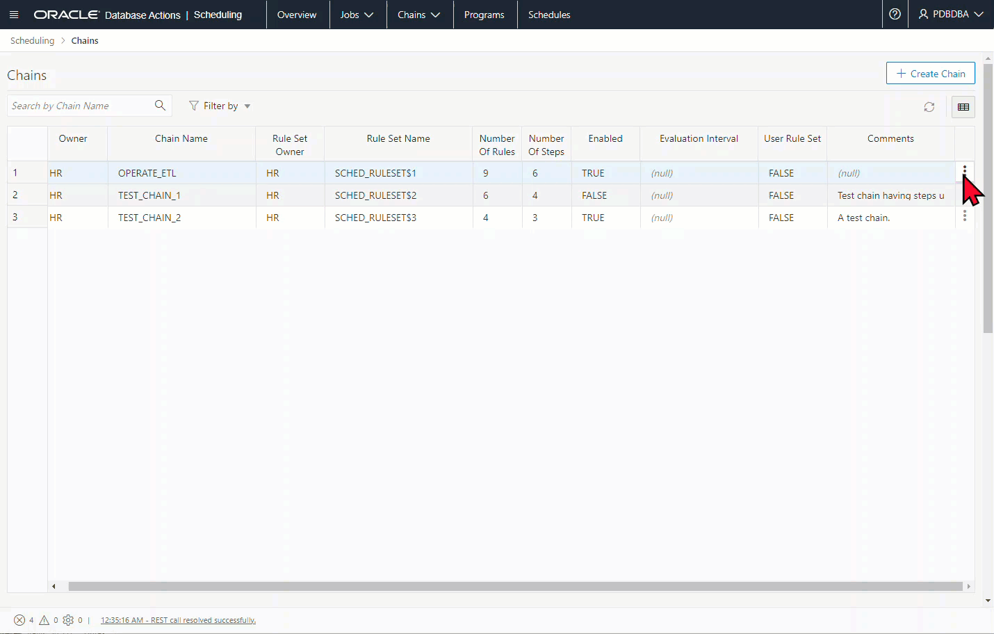
Your simple ‘task’ running can quickly expand to a whole slew of programs running. The chain tools here can really help get a handle on that complexity.
Is this everything?
Nope! There are tons of report and drill-downs throughout these pages. You can perform some limited actions on objects like running, disabling, or enabling a job. But, I think I’ve demonstrated the bulk of the UI patterns and ‘cool’ features we’ve built in this release.
Coming up later this year will be things like –


, and how to secure it!")