
People like pictures and charts. People also like data, but the data often needs to tell a story. Looking a a spreadsheet of raw data vs looking at the accompanying charts for example.
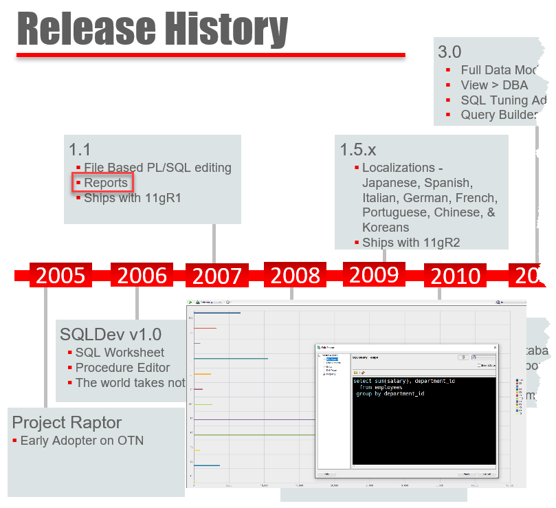
We’ve known this of course for a very long time! If we gaze back at SQL Developer’s history, the reporting feature was included in version 1.1.
With our release of Oracle REST Data Services version 21.2 last week, the Database Actions feature got a major upgrade – the ability to make charts!
This is a long post, but don’t worry. I’ve included lots of pictures, so feel free to scan. There’s a pretty good chance I’ll publish a TL/DR; video to YouTube, soon’ish.
Building a Chart in Database Actions
There are two entry points. You can:
- write a query in the SQL worksheet and turn it into a chart or
- open the Charts card from the Launchpad (home page)
Let’s start with #2, just to be different.
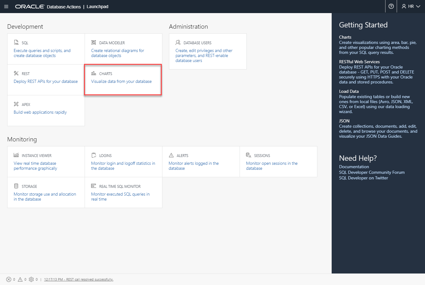
EVERY user should have access to this card/feature.
Our layout for the Charts homepage will mirror what you’ve seen in the REST, Database Users, and similar screens – a series of ‘cards’ representing the objects. And up top, a ‘Create’ button.
If this is your first chart, you’ll be offered a Guided Tour of the interface –
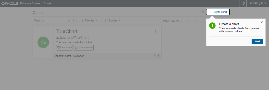
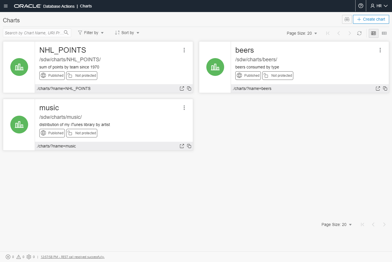
I’ve already create a couple of reports, so my dashboard is populated with two cards.
In the desktop implementation of this feature, your reports are saved on the local machine, stored as XML files along with the rest of your SQL Developer application settings and files.
In Database Actions, we’ll be defining Charts in the database itself – alongside your schema’s REST APIs. This is a very important distinction. It determines just how SHARING and SECURING your charts will be accomplished.
But first, let’s build a chart from scratch.
1. Creating a Chart
Clicking the ‘Create Chart’ button will open a slider panel on the right hand side of your screen. You’ll see something like this –
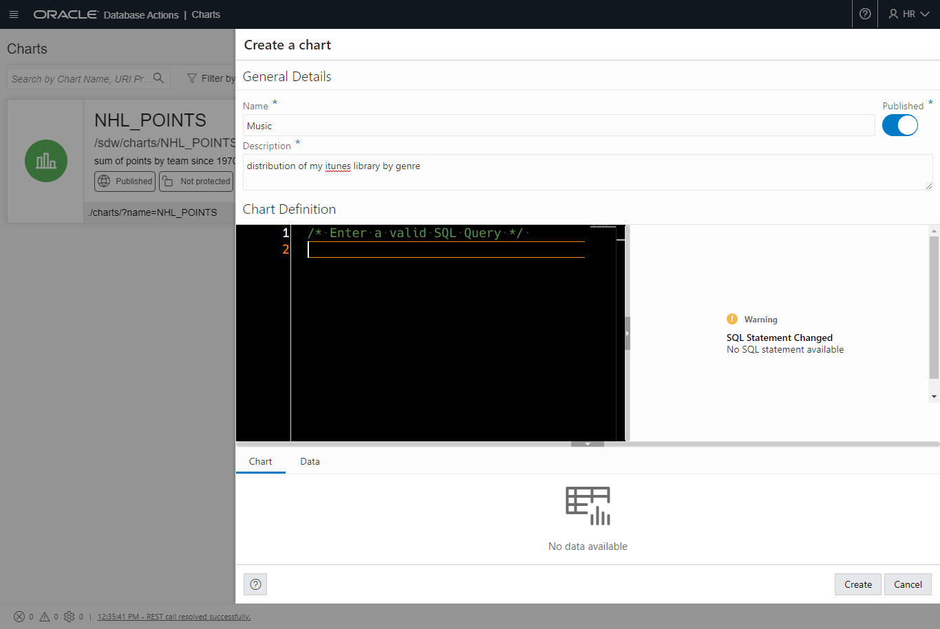
As we begin to type into the ‘code editor’ section of the report definition, a few things will start happening…
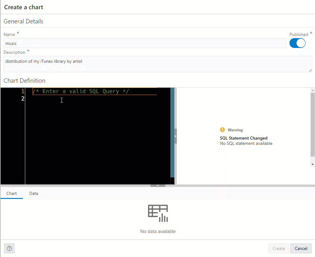
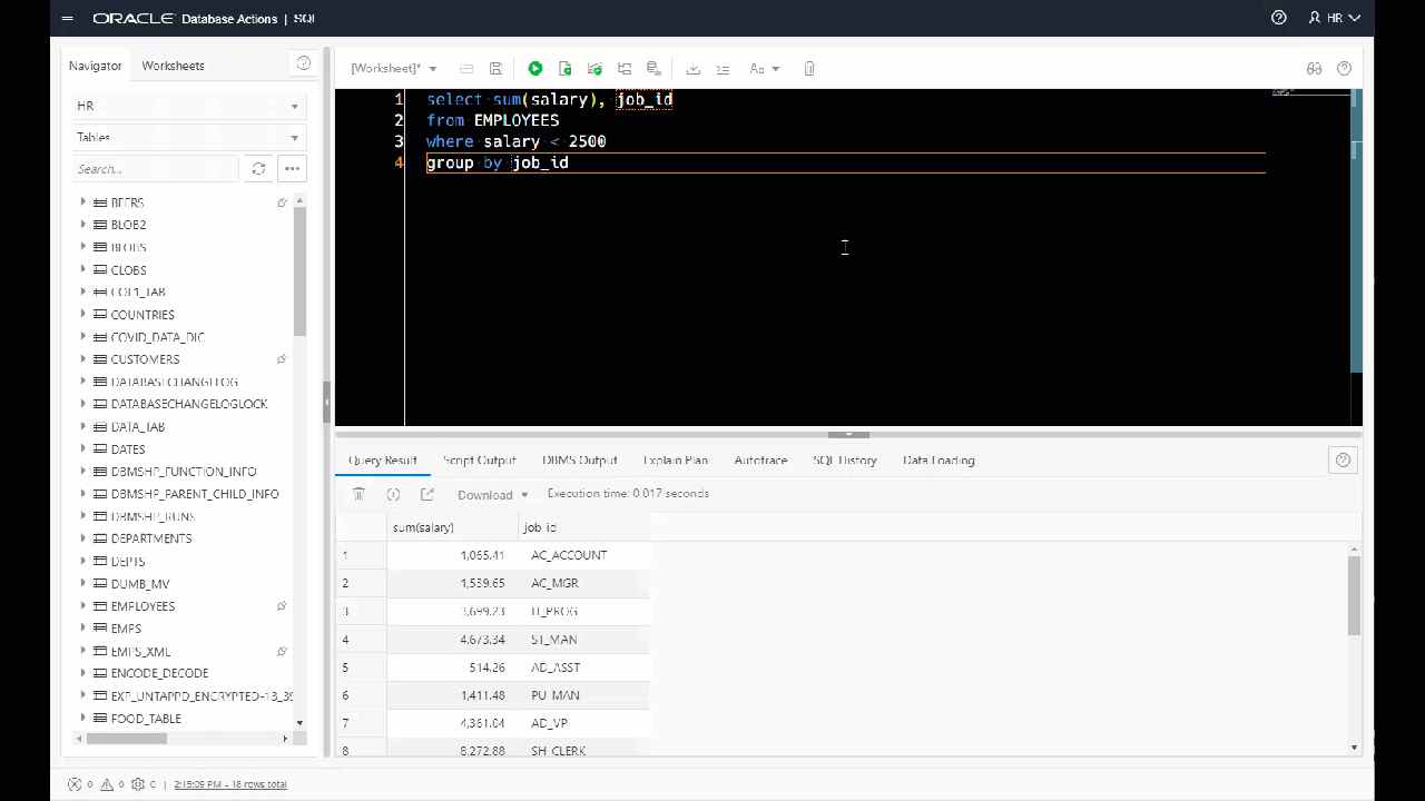
For the query to be ‘valid’ for a chart, we need two columns – a numerical field. That’s going to be the ‘Value’ column. And then a second value to be used as the chart label. That can be a number or text field.
In my case I wanted to sum up the music catalog by ‘Artist,’ so I went back to my query and added a count(*) and GROUP BY clause.
The Chart dialog notices my query has changed, so it updates the label and value columns list.
After I’ve set those attributes, I can click the ‘Preview’ button – that will run the query, get the data, and print a mini-version of the Chart below.
That ‘Auto-preview’ check box? It does exactly what it sounds like, as you’re typing your query, we’ll be validating it AND executing it to print the chart below. This isn’t enabled by default, as your queries could be slow/expensive. We’ll let you tell us when you’re ready to run them.
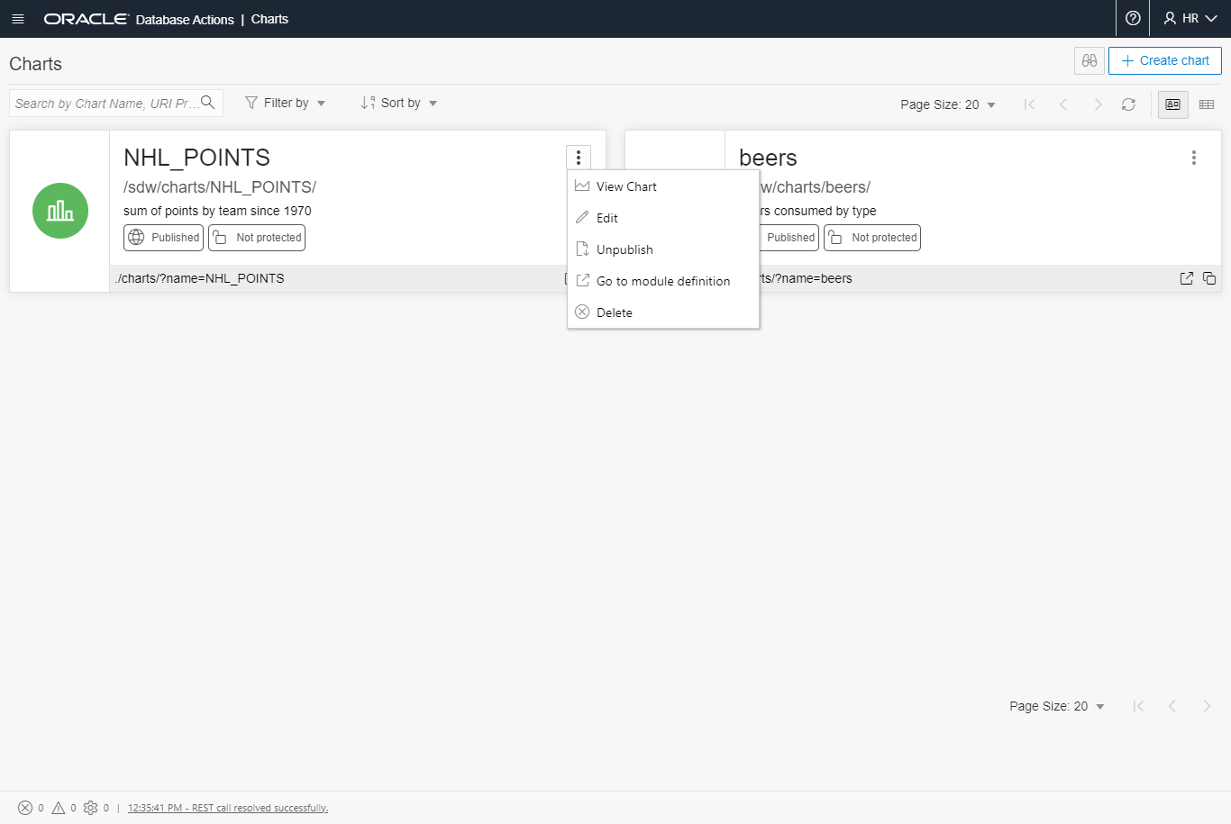
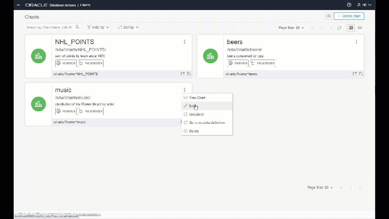
After clicking the ‘Create’ button, we’ll be back at our Charts homepage, and I’ll have a new Card with my ‘music’ report.
Ok, we’ve previewed the chart, but now I actually want to open/run it.
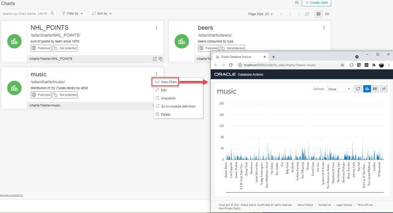
This chart is OK..but not very useful. Let’s edit it!
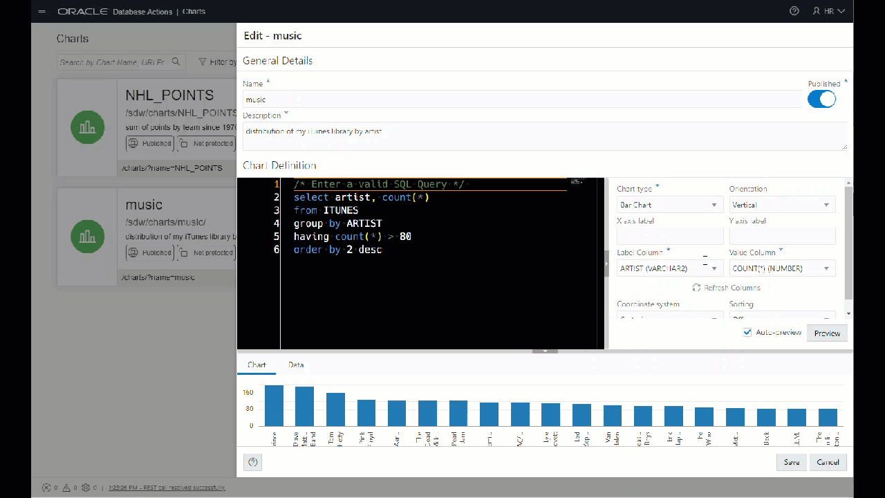
I’ve got too many data points. Let’s trim it down some, with SQL. And also, I want to order the list.
You’ll notice there’s a SORTING control on the chart definition.
So as the data comes down to the browser, the chart itself can apply the sort. OR…I can have the database do this for me, via the SQL. If I have a lot of data points, thousands vs dozens, you’ll probably want to use ORDER BYs. Why? My DB is faster at processing large amounts of data with SQL than my browser is with javascript.
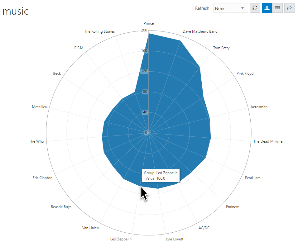
Charting Types
Let’s go through all of the types of charts.
I kind of like Polar, just because it’s different. You be the judge for when it’s the appropriate medium for telling your story.
How it works
There are two major components in play, a RESTful Web Service that delivers the the data and the definition of the report, and our Oracle JET charts.
Running the report, you can see the GET request made to the API, and the data coming back, and array of JSON documents.
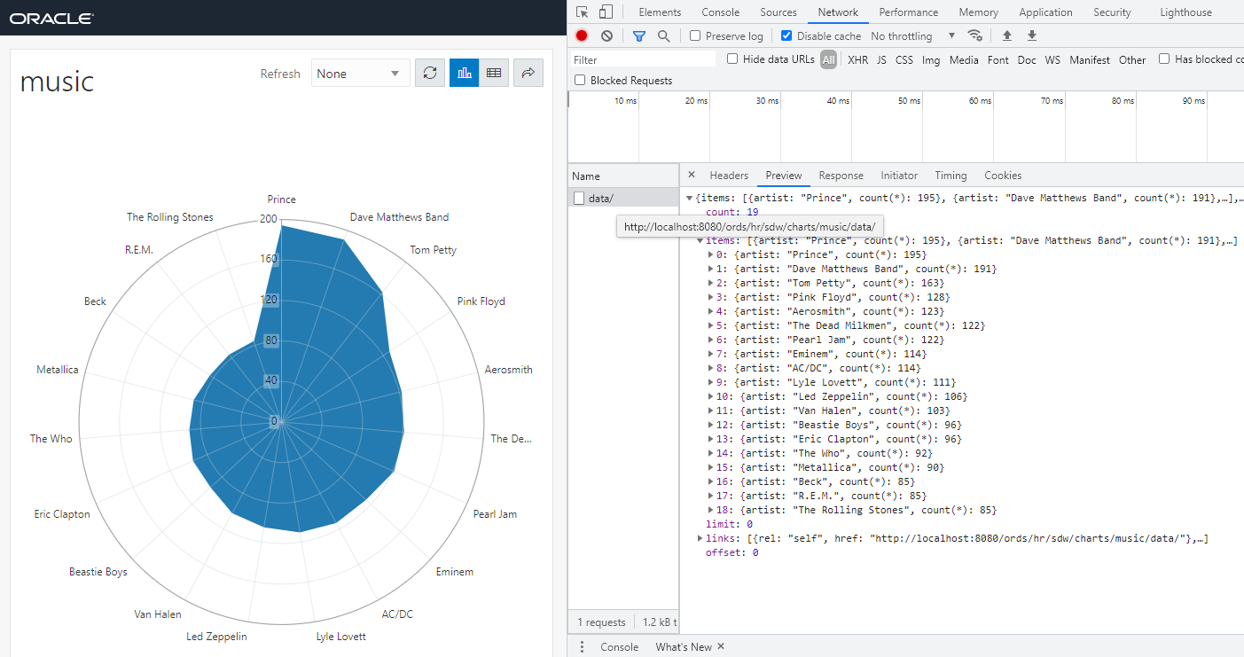
Tip: The JSON payload from the data/ API is going to be used to render the report in your browser. IF your API returns say..more than 3,000 ‘rows,’ your browser isn’t going to be happy. WHERE, GROUP BY, and HAVING clauses are going to be your browser’s friend.
Since the data and report are being delivered by an ORDS REST API, there should be a REST Module somewhere, right?
Yes! And you can navigate to it from the Chart card.
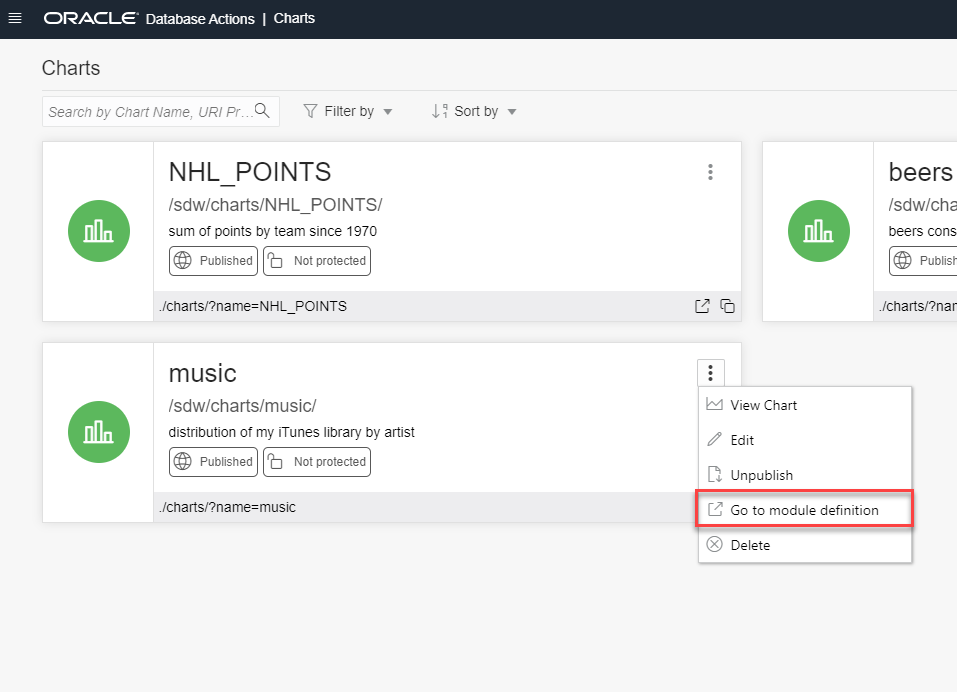
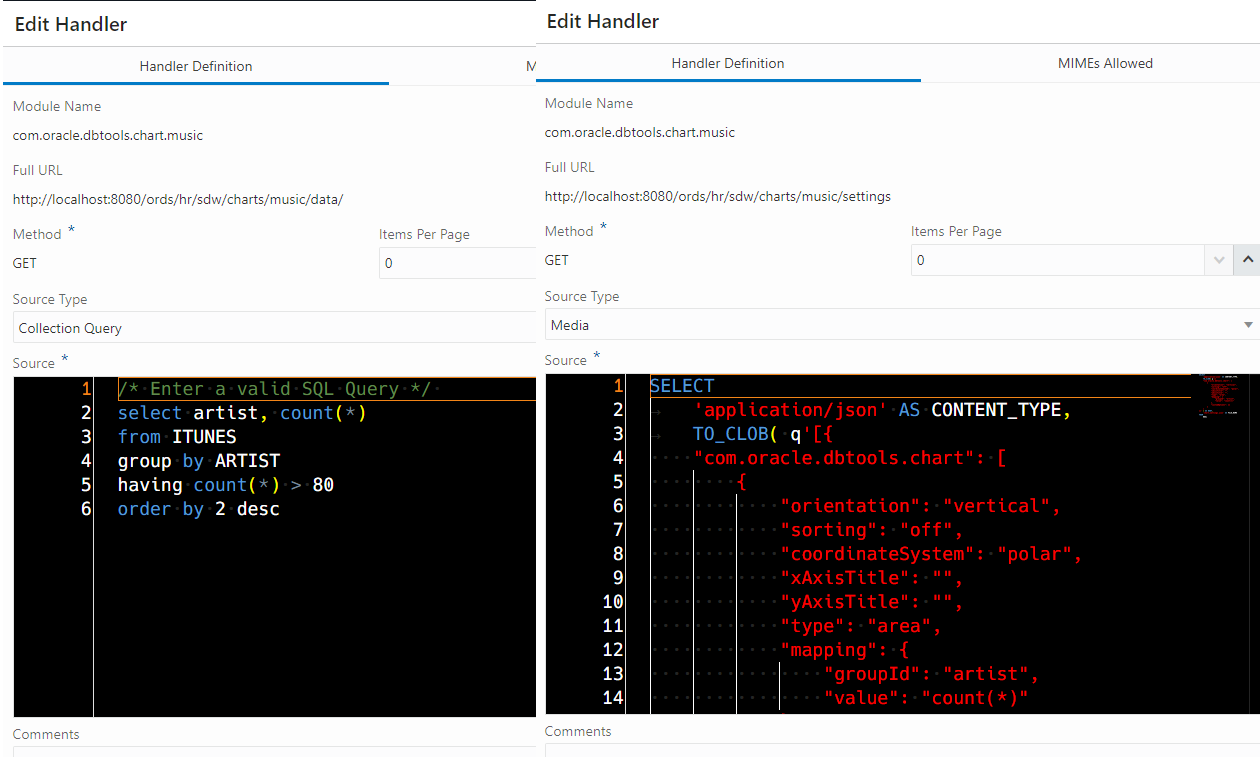
So in my REST workshop I’ll have one module per report. Each report will have two templates, each template having a GET handler.
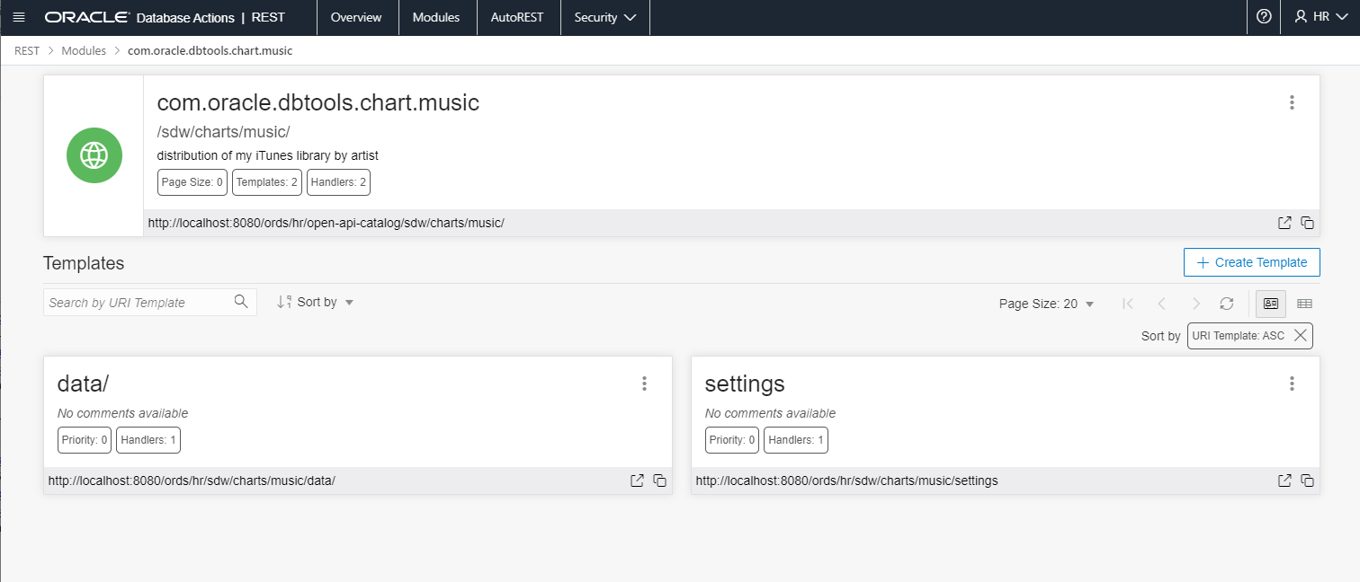
And we can look at these, if we want, just like any REST definition. We can also Edit them from here, but I wouldn’t. Better to edit the Chart from the Charts UI. It would be easy to make a mistake here, and render the Charts interface useless.
Sharing Reports
It’s as simple as sharing the URL.
But, of course, nothing is quite that simple.
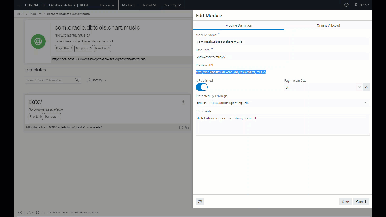
You’ll probably want to secure this report? (YES!) Since it’s backed by REST Module, access to the URI is gated by the authenticated user’s list of privs accessed by their given roles, e.g. Authorization.
So if we go back to the Module, and pull up the properties, we can see it’s current Unprotected. And we can assign a security setting.

I went with something that’s included with my Database Actions authenticated session (so database auth to HR) –
Is this it?
Heck no! This is stage 1 of our evil plan to take over the world, pinky.
Our larger idea is to allow you to build dashboards. These dashboard would be a collection of charts. Sound familiar? Yeah, you could build your own Instance Viewer.
We’ll have the second stage of this feature ready later this year.
But you said there were two ways to build a chart!
Oh yeah. If you’re writing SQL in the worksheet, you can do this –


4 Comments
Hi, can we create alerts for custom charts ?
Nope, this isn’t a monitoring solution, it just shows you what’s happening at any point in time.
can we put tables in the dashboards ?
select * from table…add a chart, run, then flip to table view